
Polynomial Regression is a type of regression analysis where the relationship between independent and dependent variables is represented by an nth degree polynomial.
These models are typically fitted using the method of least squares, which minimizes the variance of the coefficients, as per the Gauss-Markov theorem.
Essentially, Polynomial Regression is a specialized form of Linear Regression, used when a curvilinear relationship exists between variables. By fitting a polynomial equation to the data, it captures underlying patterns more effectively than a simple linear model.
When to use Polynomial Regression?
Use polynomial regression when your data exhibits a relationship that isn’t well captured by a straight line. If you notice that the residuals of a linear fit show a clear pattern, it indicates that a linear model is insufficient.
Opt for polynomial regression to model datasets with curves or varying trend directions. This approach is particularly useful in fields like finance, biology, and engineering, where variables often interact in complex, nonlinear ways.
However, be cautious of overfitting; choose the polynomial degree that provides a good balance between simplicity and flexibility.
##Insert image comparing using linear model and Polynomial Model
In the above image we can observe the different. When using Linear model, the straight line does not fit correct with the graph.
In the polynomial graph, the best fit line aligns well with data. Lets understand indepth by seeing implementation of polynomial regression in python.
click here To download dataset used in this example
Below is the Salary dataset of various position offered in coporate
| Position | Level | Salary |
|---|---|---|
| Business Analyst | 1 | 45000 |
| Junior Consultant | 2 | 50000 |
| Senior Consultant | 3 | 60000 |
| Manager | 4 | 80000 |
| Country Manager | 5 | 110000 |
| Region Manager | 6 | 150000 |
| Partner | 7 | 200000 |
| Senior Partner | 8 | 300000 |
| C-level | 9 | 500000 |
| CEO | 10 | 1000000 |
Implementation in python
import numpy as np
import pandas as pd
import matplotlib.pyplot as plt
Importing necessary python libraries, so here we are importing numpy, pandas, matplotlib libraries
dataset = pd.read_csv('Position_Salaries.csv')
X = dataset.iloc[:,1:-1].values
Y = dataset.iloc[:,-1].values
We start by importing the dataset using pandas read_csv function, which reads the CSV file ‘Position_Salaries.csv’ into the DataFrame dataset. We then separate the independent and dependent variables. X is assigned the independent variables using dataset.iloc[:, 1:-1].values, which selects all rows and columns from the second to the second-to-last. Y is assigned the dependent variable using dataset.iloc[:, -1].values, which selects all rows and the last column.
Training the Linear Regression model on the whole dataset
from sklearn.linear_model import LinearRegression
regressor = LinearRegression()
regressor.fit(X,Y)
Next, We are importing the LinearRegression class from scikit-learn’s linear_model module. We then create an instance of LinearRegression and assign it to the variable regressor. The fit method of the regressor is called with X (independent variables) and Y (dependent variable) to train the linear regression model. This method fits the linear model to the provided data, enabling it to make predictions based on the relationship between X and Y.
Training the Polynomial Regression model on the whole dataset
from sklearn.preprocessing import PolynomialFeatures
poly_regre = PolynomialFeatures(degree=4)
X_poly = poly_regre.fit_transform(X)
lin_reg = LinearRegression()
lin_reg.fit(X_poly, Y)
We import PolynomialFeatures from scikit-learn’s preprocessing module and create an instance poly_regre with a polynomial degree of 4. The fit_transform method is used on X to generate X_poly, which includes polynomial features up to the 4th degree. We then create a LinearRegression instance lin_reg and fit it to X_poly and Y using the fit method. This trains the polynomial regression model, allowing it to capture nonlinear relationships between X and Y.
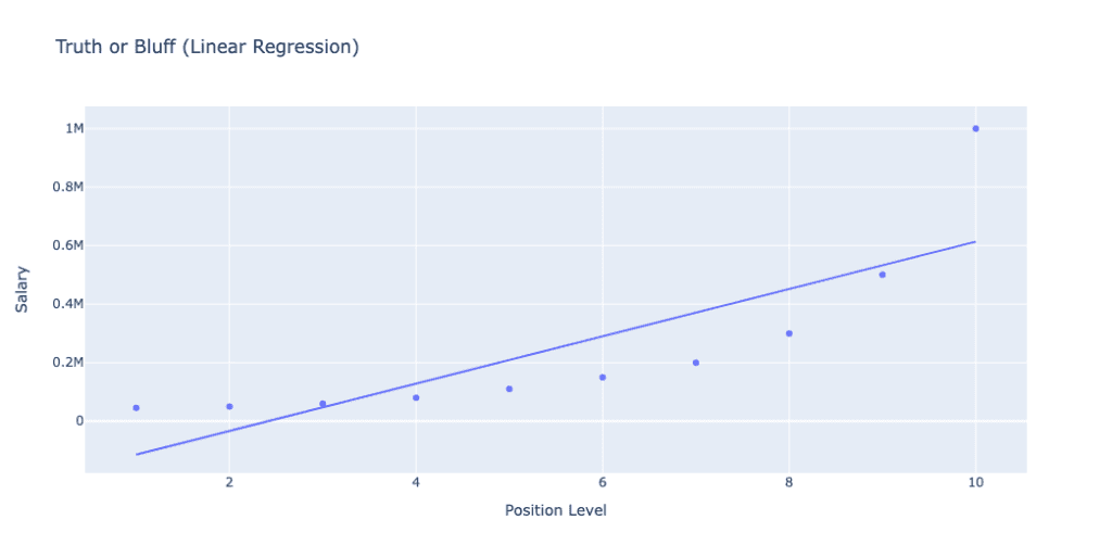
visualising the Linear Regression Result
import plotly.express as px


# Scatter plot
fig = px.scatter(df, x='Position Level', y='Salary', title='Truth or Bluff (Linear Regression)', labels={'x': 'Position Level', 'y': 'Salary'})
fig.add_traces(px.line(x=X.flatten(), y=regressor.predict(X).flatten(), labels={'x': 'Position Level', 'y': 'Salary'}).data)

# Show the plot
fig.show()
We import plotly.express as px for visualization. A scatter plot is created using px.scatter, showing actual data points with ‘Position Level’ on the x-axis and ‘Salary’ on the y-axis. The line plot is added using fig.add_traces to show the linear regression predictions. Finally, fig.show() displays the plot.
The linear model attempts to fit a straight line through the data points, but as evident from the plot, it does not capture the complexity and potential non-linear relationship between the position level and salary, indicating that a more complex model, like polynomial regression, might be needed for better predictions. The plot title ‘Truth or Bluff (Linear Regression)’ and axis labels ‘Position Level’ and ‘Salary’ provide context.
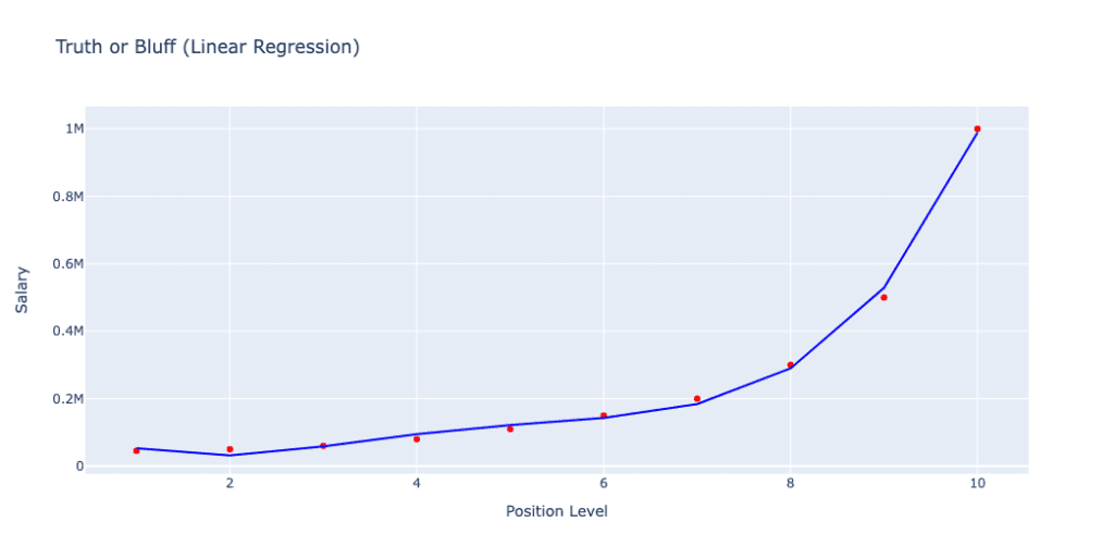
plt.scatter(X,Y,color='red')
plt.plot(X,lin_reg.predict(X_poly), color='blue')
plt.title('Truth or Bluff(Linear Regression)')
plt.xlabel('Position Level')
plt.ylabel('Salary')
plt.show()
We use plt.scatter to create a scatter plot of X (Position Level) and Y (Salary) with red points. The plt.plot function plots the polynomial regression line with X and the predictions from the model lin_reg.predict(X_poly), in blue. The plot is titled ‘Truth or Bluff (Polynomial Regression)’, and axes are labeled ‘Position Level’ and ‘Salary’. Finally, plt.show() displays the plot.
The blue curve represents the predictions made by the polynomial regression model with a degree of 4. Unlike the linear regression model, the polynomial regression model captures the non-linear relationship between position level and salary more accurately, fitting the data points closely and reflecting the complexity of the underlying trend
In this blog, we explored the application of polynomial regression to model the relationship between position levels and salaries. Starting with a simple linear regression model, we observed its limitations in capturing the true complexity of the data. By transforming the features and using polynomial regression, we were able to achieve a more accurate fit, highlighting the importance of selecting appropriate models for complex datasets.
- Linear Regression: Provides a straightforward approach but may fall short for non-linear relationships.
- Polynomial Regression: Enhances the model’s ability to fit complex patterns by including polynomial terms.
- Model Selection: Critical for accurate predictions; always evaluate multiple models.
By leveraging polynomial regression, we demonstrated its effectiveness in scenarios where linear models are insufficient. This emphasizes the need for flexibility and experimentation in machine learning to achieve the best results.